ARHLEG.
Intro
Arhleg↗ is a professional physical archiving service website that transforms traditional document management into a premium digital experience.
The website serves Arhleg.ro, a Romanian company specializing in organizing, labeling, and managing physical archives for institutions ranging from schools to local governments. The design challenge was to make a traditionally mundane service feel modern, trustworthy, and approachable.
This project showcases how thoughtful visual design can elevate any industry, proving that even physical archiving services deserve a cutting-edge web presence.
Design Philosophy
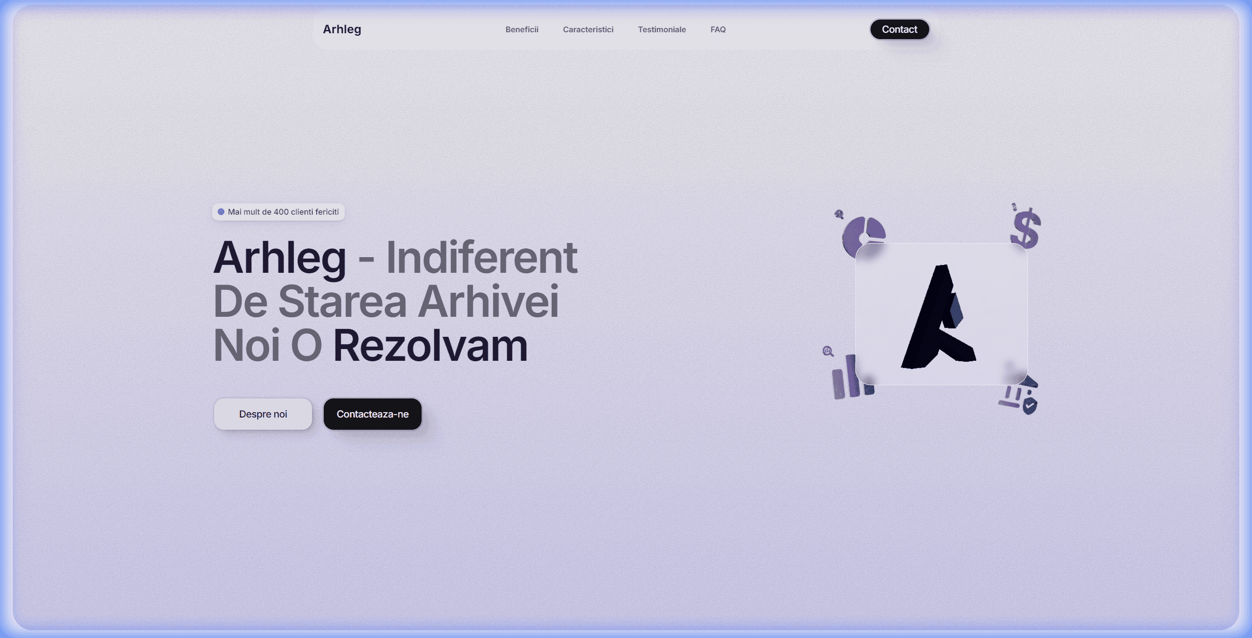
The design embraces glassmorphism, a modern aesthetic characterized by frosted-glass surfaces, soft gradients, and layered translucency. This creates a sense of depth and sophistication while maintaining clarity and readability.
The color palette is intentionally soft: light purples, gentle grays, and clean whites evoke professionalism without sterility. Custom 3D illustrations featuring document icons, charts, and the distinctive "A" logo symbol add personality and visual interest.
Trust & Credibility
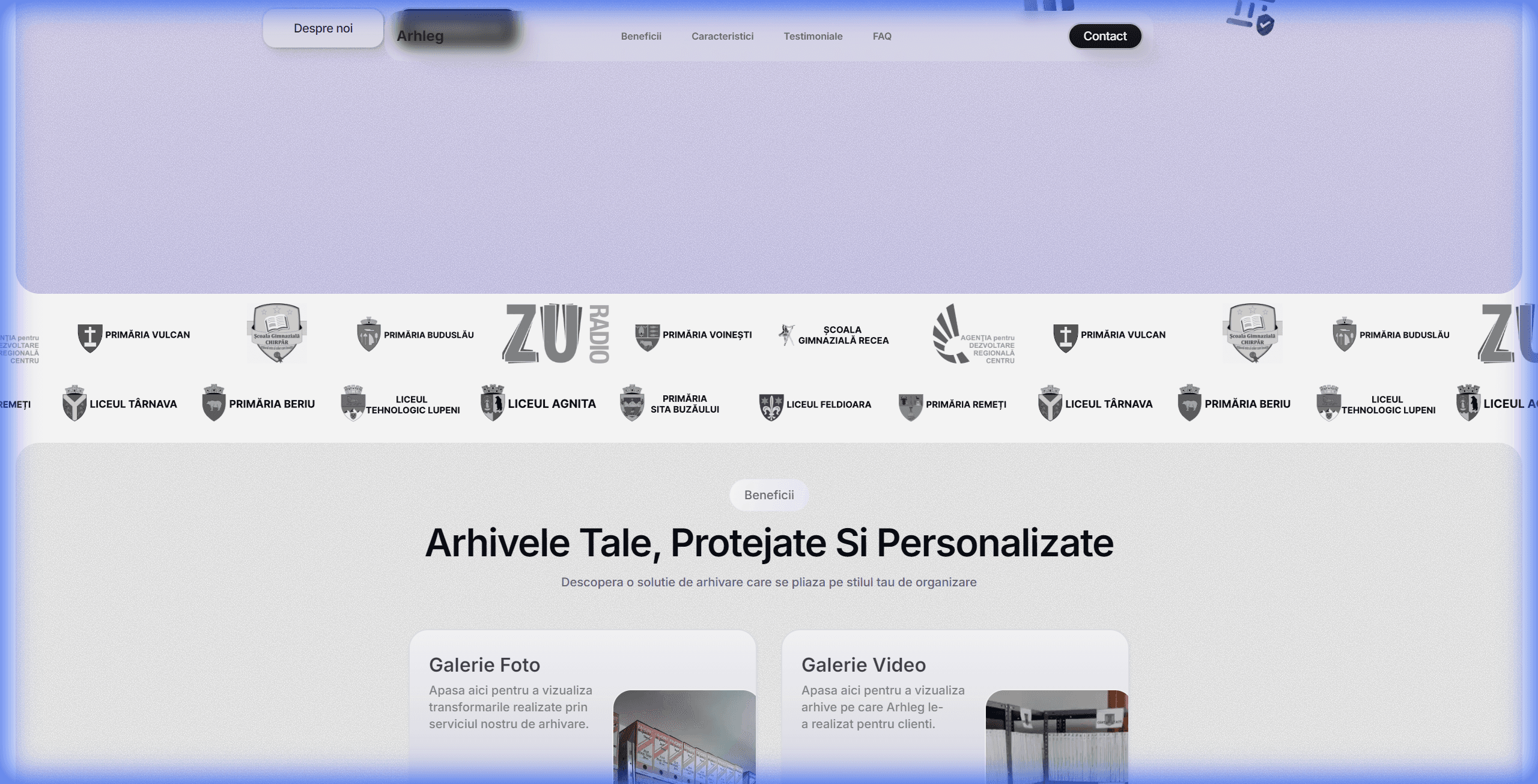
A scrolling carousel of client logos, featuring schools, city halls, and institutions like "Primăria Vulcan" and "Liceul Tehnologic Lupeni" immediately establishes institutional credibility. This social proof is crucial for a service handling sensitive documents.
Photo and video galleries provide transparency, showing real archives being processed. This behind-the-scenes access builds trust and demonstrates the company's professional approach to document management.
Good design is not just about aesthetics, it's about communicating trust and expertise before a single word is read.Design Principle
Value Proposition
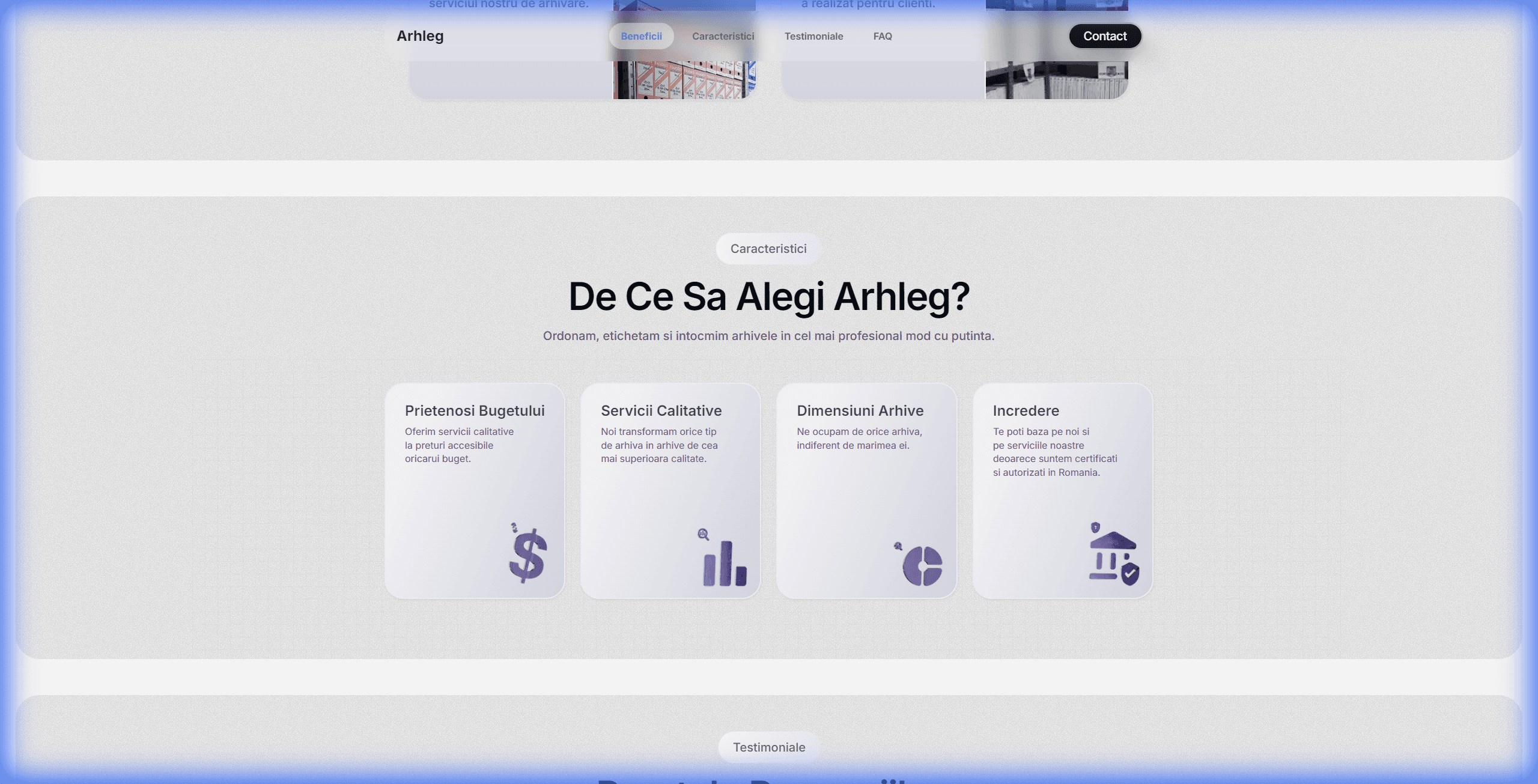
The characteristics section uses clean card-based layouts with custom icons to highlight four core pillars: Budget Friendly, Quality Services,Any Archive Size, and Trust (fully certified and authorized).
Each card features a subtle glassmorphism treatment with soft shadows and rounded corners, creating visual hierarchy while maintaining the cohesive design language throughout the page.
Conversion Focus
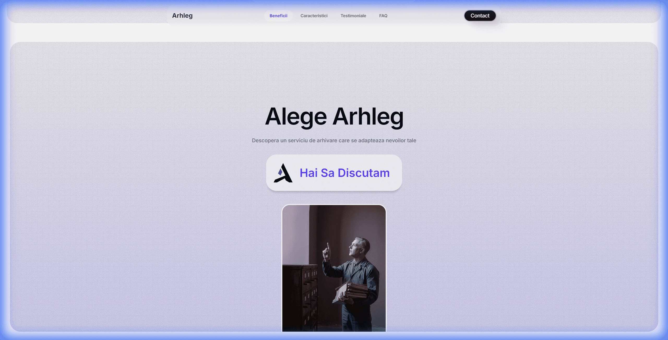
Rather than a traditional dense footer, the site culminates in a powerful call-to-action section. "Alege Arhleg" (Choose Arhleg) with a prominent "Hai Sa Discutam" (Let's Talk) button creates a clear conversion path.
The human element, featuring a real person working in an archive setting, adds warmth and relatability to the digital experience, bridging the gap between online browsing and real-world service.
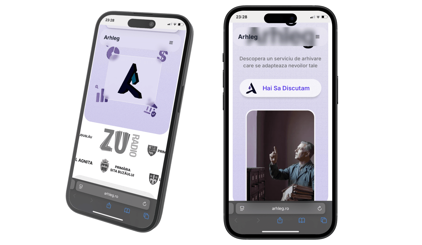
Mobile
The responsive design maintains the glassmorphism aesthetic across all devices. Navigation transforms elegantly, and the 3D illustrations scale appropriately while preserving the premium feel that defines the desktop experience.
Conclusion
Arhleg demonstrates that thoughtful design can transform any industry's digital presence.
By combining glassmorphism aesthetics with strategic trust signals and clear conversion paths, this project proves that even traditional services can have a modern, engaging web experience.
The design successfully balances visual sophistication with usability, creating a website that not only looks premium but effectively communicates the company's professionalism and reliability.
Excited by this project? Want to discuss it further?Don't hesitate to reach out!